concept designs
The following concepts and designs compare the websites of "Super 8" and "Ritz Carlton," highlighting key differences and similarities while modifying certain features to enhance user experience.
Signifiers
Signifiers play a crucial role in user interface design by serving as cues or indicators that communicate how elements within a system should be utilized or what actions are available to users. They encompass various visual, auditory, or tactile elements that provide clear guidance on how to interact with the interface. Whether through buttons, icons, labels, colors, or sounds, signifiers effectively convey information about the functionality and purpose of different elements within a design.
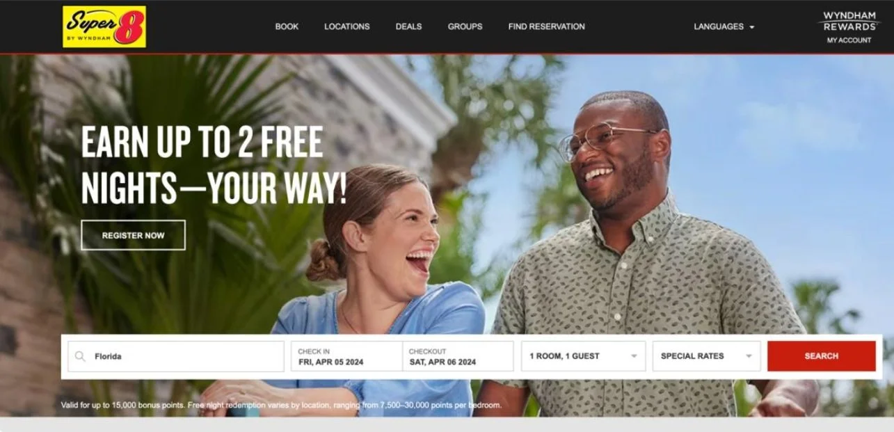
Comparison: The design of the Super8 website tends to be straightforward and utilitarian, with clear signifiers for actions such as booking rooms or finding information. On the other hand, the Ritz Carlton website exudes luxury and sophistication, with signifiers that evoke a sense of exclusivity and high-end experience. In both cases, the signifiers align with the brand image and target audience, influencing user behavior accordingly. Super8's signifiers are more focused on efficiency and accessibility, while Ritz Carlton's signifiers emphasize prestige and quality.
Goal: The goal related to signifiers could be to enhance user engagement and conversion rates by making important actions more noticeable and intuitive.
Before:
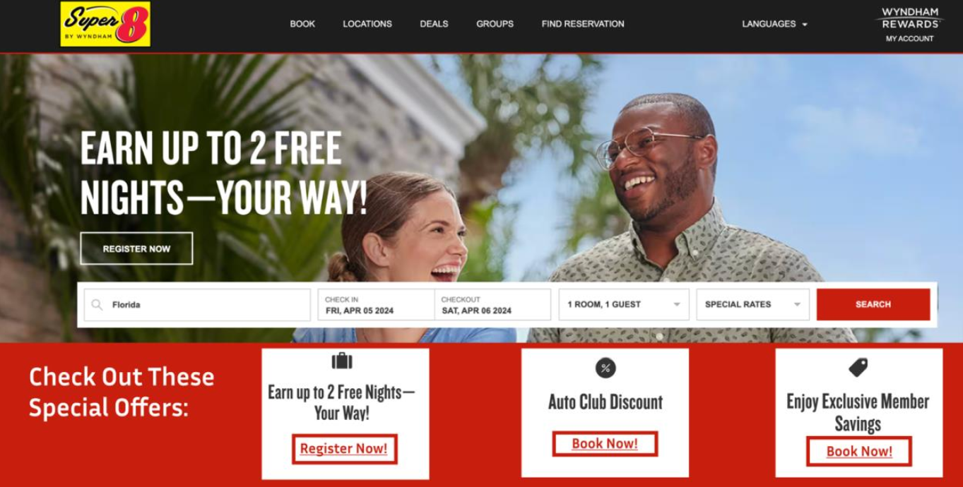
After:
explanation
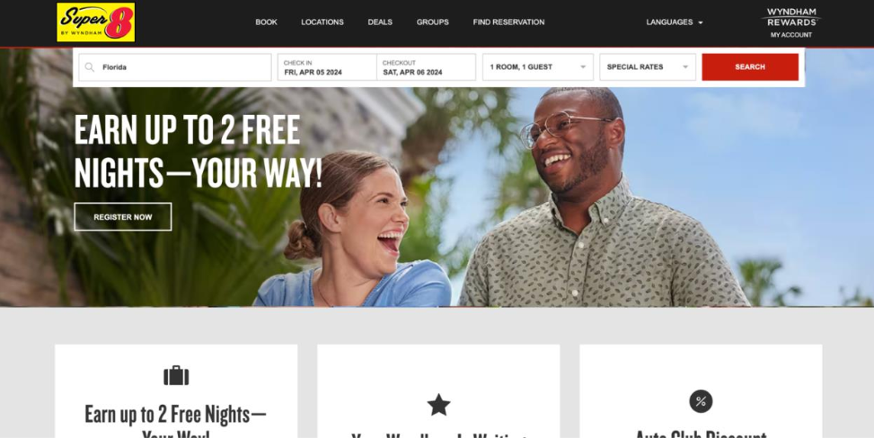
Adding a section at the bottom of the Super8 homepage for special offers with red "Register now" or "Book now" buttons strategically enhances signifiers. The prominent red buttons draw attention and convey urgency, encouraging immediate action. Clear text on the buttons reduces ambiguity and facilitates interaction. This placement ensures the section doesn't overwhelm users initially but provides a clear next step for those ready to act. This approach increases the discoverability of special offers, improves user engagement, and enhances the overall user experience by guiding users towards relevant actions smoothly.
hick’s law
Hick's Law states that the time it takes for a person to make a decision increases with the number of alternatives they have. In other words, the more choices someone has, the longer it will take them to make a decision
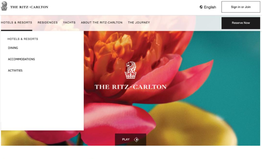
Comparison: When comparing the Super8 and Ritz Carlton websites, the design impacts human capabilities and behavior regarding Hick's Law in different ways. Super8's website tends to be simpler with fewer options, which could potentially lead to faster decision-making for users. On the other hand, Ritz Carlton's website offers more choices and features, which might result in longer decision-making times for users.
Goal: : The goal related to Hick's Law could be to streamline the decision-making process on the Ritz Carlton website by reducing the number of options presented to users at any given time.
Before:
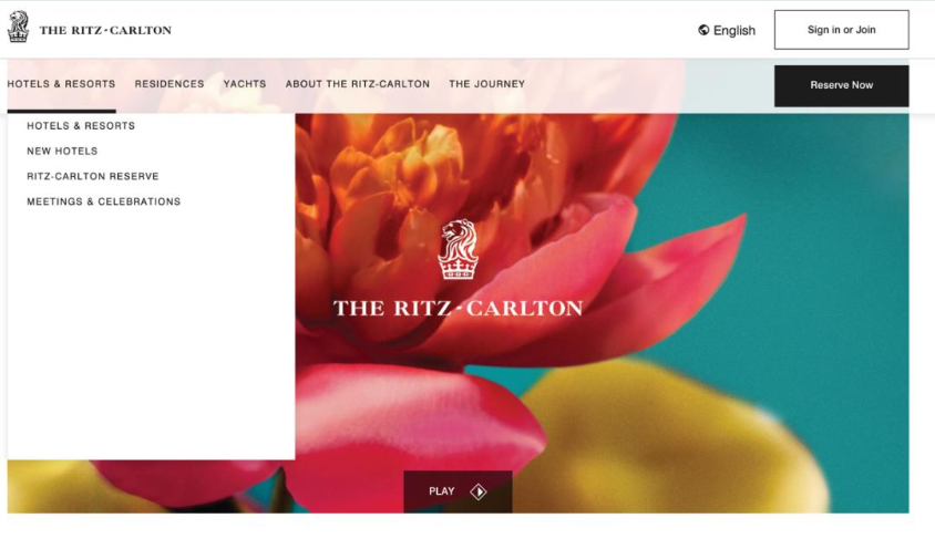
After:
explanation
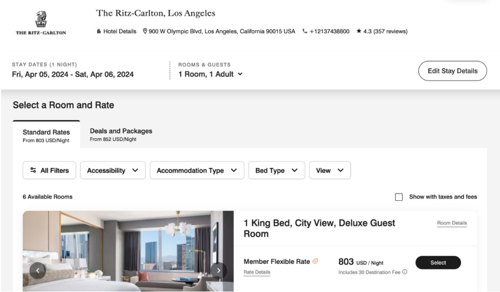
By reducing the number of options presented to users on each page, the modification aligns with Hick's Law by decreasing decision-making time. Users would be less overwhelmed and more likely to make quicker decisions as they navigate through the website. This modification also enhances the user experience by making it easier for users to find what they are looking for without being bombarded with too many choices at once.
visual search
Visual search is the process of scanning a visual environment to find a target among distractors. Visual search models can be extremely important for predicting search time in time critical environments (Lee et. al, 2017). It involves the deployment of attention to locate specific objects or features within a scene.
Comparison: When comparing Super8 and Ritz Carlton websites in terms of visual search, it's essential to consider how they organize visual elements and guide users' attention. Super8's website may have a straightforward layout, prioritizing essential information such as booking options and room features. In contrast, Ritz Carlton's website might employ more visually engaging design elements to highlight luxury amenities and create a sense of exclusivity. These differences can impact how users conduct visual searches on each site, with Super8 potentially facilitating quicker task completion due to its simplicity, while Ritz Carlton may encourage more exploratory behavior as users navigate through its visually rich content.
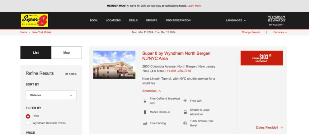
Goal: Enhance users' ability to efficiently conduct visual searches on the Super 8 website.
Before:
After:
explanation
By incorporating visual cues strategically, users' attention is directed towards key areas of interest without the need for exhaustive scanning. This modification aligns with the concept of visual search by optimizing the visual hierarchy and guiding users' attention towards relevant information, ultimately improving their ability to locate desired content efficiently. Moreover, by reducing cognitive load associated with extensive visual search, users are more likely to engage with the site content and complete desired actions, such as making reservations or exploring available amenities, effectively enhancing the user experience.
visual structure
Visual structure is like the blueprint of a website or any design, showing how things are arranged to make sense to users. It's about organizing everything – like text, buttons, and images – in a way that's easy to understand and use. Take Southwest Airlines' website, for example. They use clear sections and buttons to help you book flights without confusion. Visual structure isn't just about making things look nice; it's about making it easy for people to find what they need and do what they want on a website. It's like a roadmap that guides you through a website smoothly, making sure you don't get lost along the way (Johnson, 2014,p.33).
Comparison: When comparing the Super 8 and Ritz Carlton websites, significant differences in visual structure are evident. The Super 8 website uses a straightforward, practical approach, prioritizing simplicity, clear information, and ease of navigation without unnecessary embellishments. In contrast, the Ritz Carlton website features elegant layouts, high-quality imagery, and subtle design elements to convey luxury and sophistication, reflecting the brand's upscale image. While both sites organize content effectively, the Super 8 site emphasizes practicality and usability, whereas the Ritz Carlton site focuses on a visually rich and indulgent user experience.
Goal: To enhance the visual appeal and engagement of the Super 8 website by incorporating elements of transparency and reliance while maintaining usability.
Before:
After:
explanation
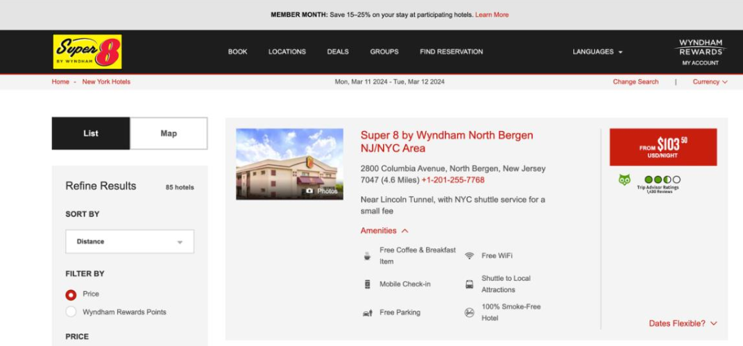
Proposing the inclusion of Trip Advisor reviews below the pricing section on the Super 8 website is commendable for enhancing user experience and trust. However, better alignment with the website's visual structure is needed. Visual structure focuses on organizing design elements to facilitate understanding, while adding reviews aims to build engagement and trust. A more cohesive approach would be to restructure the layout with a carousel or grid for reviews. Optimizing the presentation with intuitive navigation controls and subtle animations would improve user experience and ensure a seamless integration within the website design.
long term Memory
Long-term memory refers to the storage of information over an extended period, from minutes to years, and it can hold vast amounts of information for a long time. It's believed to have an almost unlimited capacity and duration
Comparison: The design of both websites impacts long-term memory differently. Super8's simple and practical design targets budget-conscious users seeking quick stays, creating a straightforward experience. Conversely, the Ritz Carlton's luxurious and elegant design aims to leave a lasting impression of high-end exclusivity. These approaches shape users' perceptions and expectations of each brand over time.
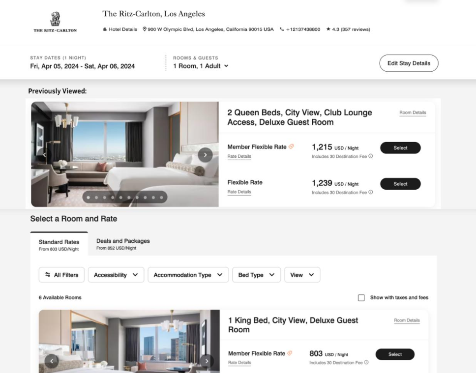
Goal: My goal is to create a feature to assist in memory aids and allows the user to return to where they previously were.
Before:
After:
explanation
Applying Hick's Law to the Ritz Carlton website design reduces cognitive load by incorporating a consistent visual element or tagline. This streamlines decision-making by presenting users with a familiar cue, facilitating quicker navigation and information processing. Repeated exposure to this cue strengthens its association with the Ritz Carlton brand, enhancing long-term memory and brand recall. Leveraging Hick's Law thus improves user experience and creates a lasting impression.
